‘Tis the season for eating, which also means it’s the season for food photography. November to December is the perfect time for hopeful cookbook creators and budding chefs to take images for the future, simply because there’s almost too much food to eat. Fortunately, that also means there’s more than enough to photograph.
Whether your images are for a poster, a magazine or an entire cookbook, at some stage you’re going to have to go to print and presentation is paramount. Yes, recipes are the centerpiece, but many content creators underestimate the impact that paper choice can have on an image’s final appearance. If you’re sharing your work with the world, you want to make sure that it looks good enough to eat. So, today we’re talking about the importance of paper choice in a way that’s sure to get your stomach rumbling—by using one of our newest gallery pieces from Toothache magazine.
Good Enough to Eat
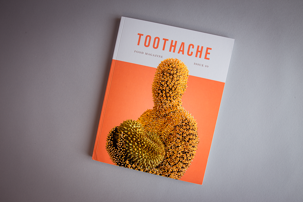
You might be familiar with Toothache magazine because your stomach led you to its mouth-watering imagery. Maybe you discovered its incredible attention to detail in design on social media or maybe its dedication to sustainability intersected with your own interests. Regardless of how you’ve come to know Toothache, nothing can prepare you for the tantalizing, quality content within each and every issue.
For starters, Toothache is a food magazine made by chefs, for chefs. Toothache features recipes, stories and conversations with some of the world’s best professional chefs. The magazine describes itself as “a collaborative project where each person is free to share whatever they’d like. Each issue has a vast array of in-depth interviews, conversations, full-page photographs and recipes geared for the professional kitchen. Although Toothache is for cooks and chefs, it’s also great for the food lover who’s interested in learning about some of the world’s most celebrated chefs.”
I share all of this with you to make it clear—Toothache knows what it’s doing and so does its audience.
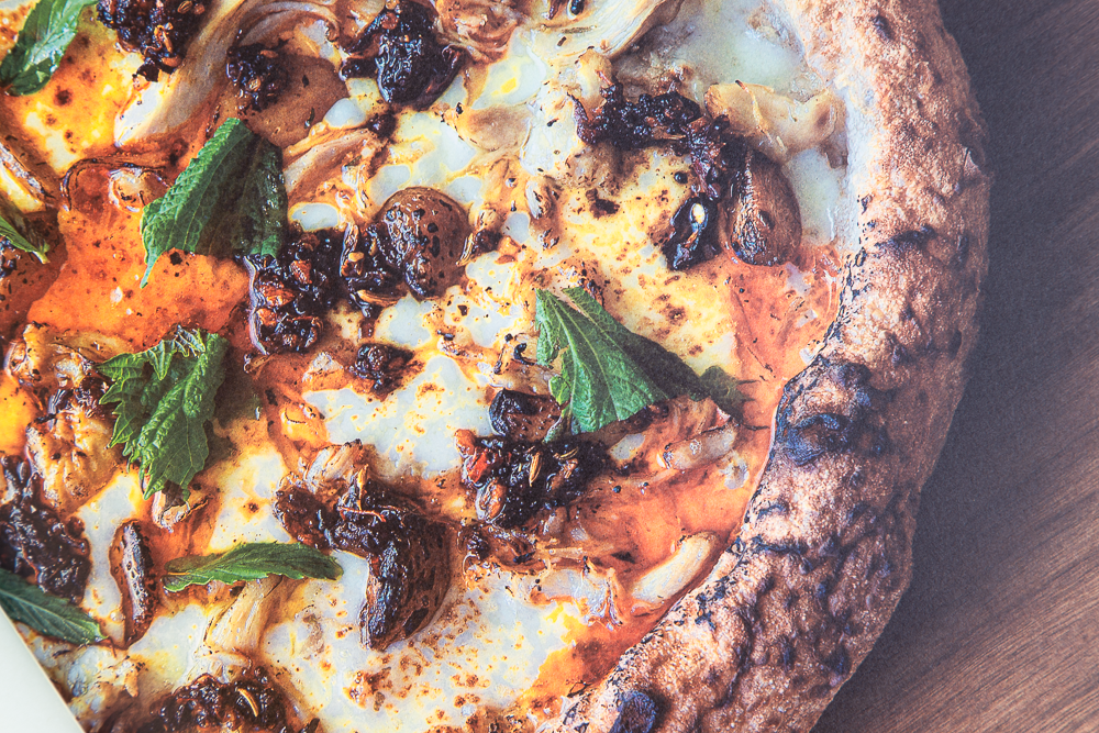
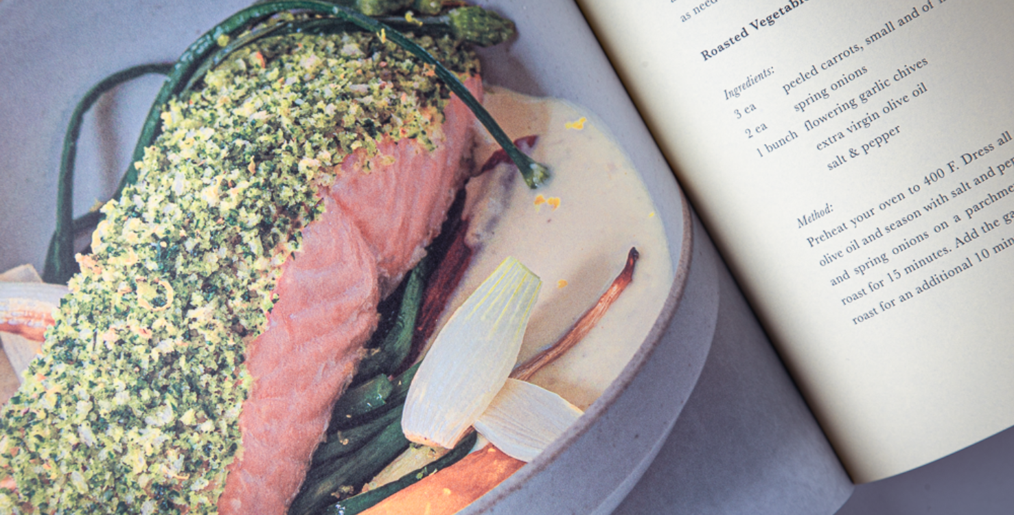
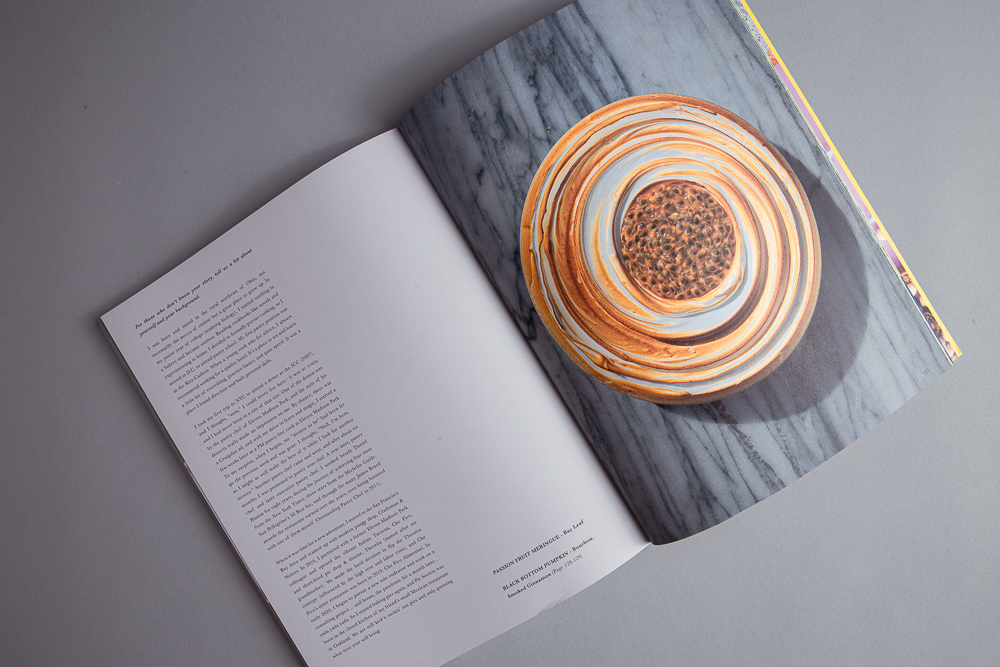
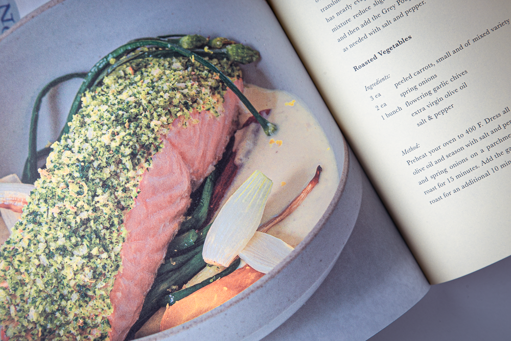
The magazine creators understand that their content will be judged on both the quality of the recipe and the presentation of the food. Any imperfections in the final product could be mistakenly attributed to the food or can detract from the overall effect. When it comes to creating images of meals for an audience that prepares food for a living—or any piece where you truly want to make an impression—the printed piece cannot fall flat. For example, the 9th issue of Toothache Magazine was printed on Lynx® 30 for the inside of the magazine, resulting in mouthwatering images with sharp contrast and minimal show-through. If you’re trying to make your photos pop off the page and show textures and you know you’re going to be dealing with heavy ink coverage, your paper choice matters.
Tips and Tricks
Here are some tips for getting the most out of your images:
- Work with your printer. When it comes to paper selection, print techniques and everything in between, your printer is your best resource. They are the subject matter experts, and you should always establish an open line of communication and make your goals clear. Trust that your printer can guide you to the best result.
- Paper choice! I know I sound like a broken record, but your paper choice can have a significant impact on how an image prints. How well the sheet holds ink, its formation and the paper’s tone all play a part in a printed piece.
- Think long-term. You never know when you may be making a first impression. Achieving the best result, even when some of the details seem nitpicky, may open new avenues for you down the road or give your piece more longevity. What you spend on quality on the front end may be reaped many times over when you collect your results.
In many ways, paying attention to the small things in print can bring many rewards to your labor of love.
Be sure to check out Toothache’s website to get a copy of Issue 9. We recommend you eat beforehand so that you and your stomach can look beyond the images on the page and appreciate the entire printed piece for the work of art that it is.
For more incredible works of print, visit paper.domtar.com/gallery
Discussion