Looking for a way to make your next project pop? Use color paper. Take a look at these tips for designing and printing on color paper.
When it comes to print, nothing grabs a person’s attention like color. This is partly because the brain notices color before words or shapes. As a result, color often can be the sole reason someone chooses to purchase a specific product.
With print projects, the impact of color is undeniable. Research has found that the use of color:
- improves readership as much as 40 percent.
- enhances comprehension by 73 percent.
- increases retention by 18 percent.
Clearly, color is an important consideration for any print project. But color isn’t limited to ink blends, logos and photographs. It also can include the paper on which the project is printed.
Using color paper is a great way to make a piece more interesting. For example, used as an accent piece in an annual report, a booklet or a brochure, it’s a great way to call out information and keep your audience engaged.
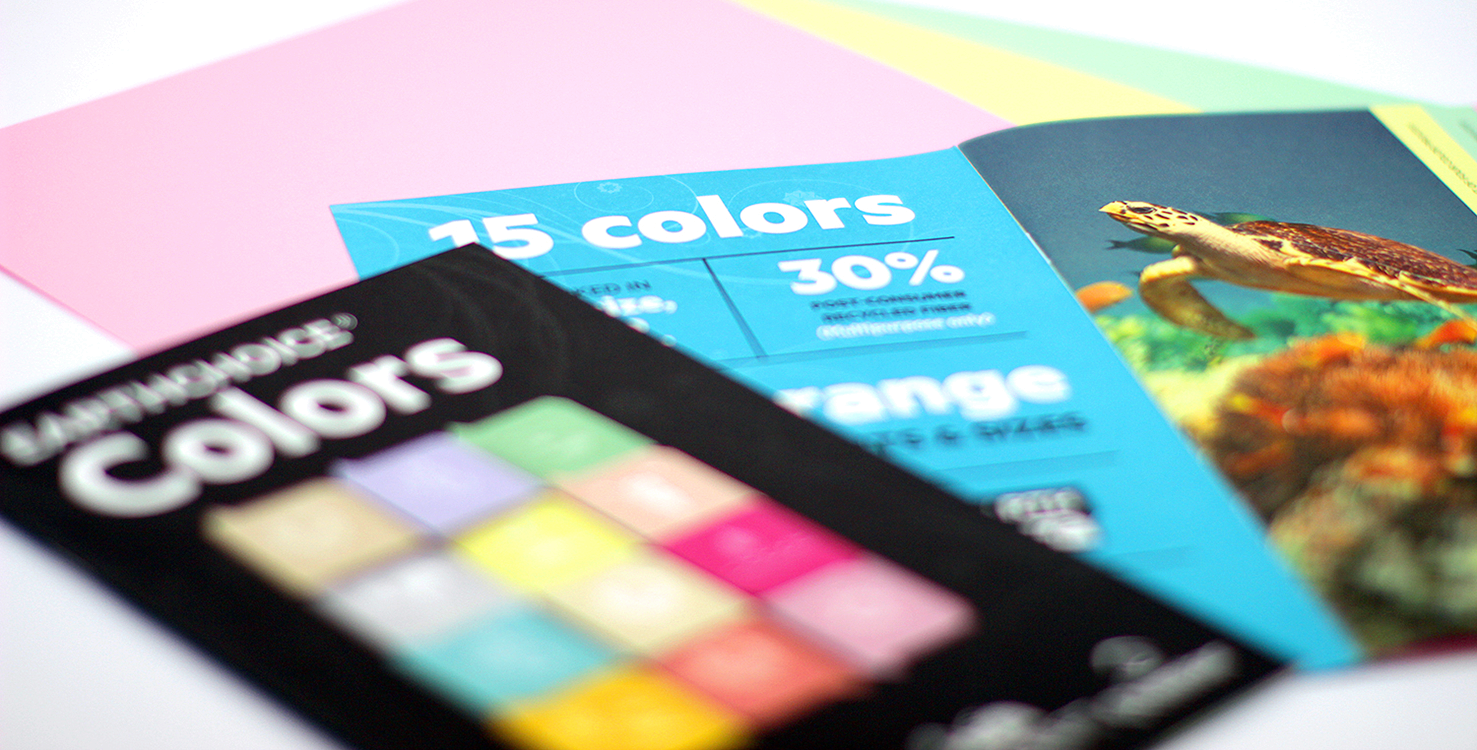
Domtar’s EarthChoice® Colors & HOTS® line gives designers high-quality, environmentally responsible papers to incorporate into any project. With 15 Colors and 11 HOTS®, there are plenty of eye-popping shades from which to choose. And if you’re looking for more subtle color, Cougar® Natural and Lynx® Cream White are great options.
Discussion