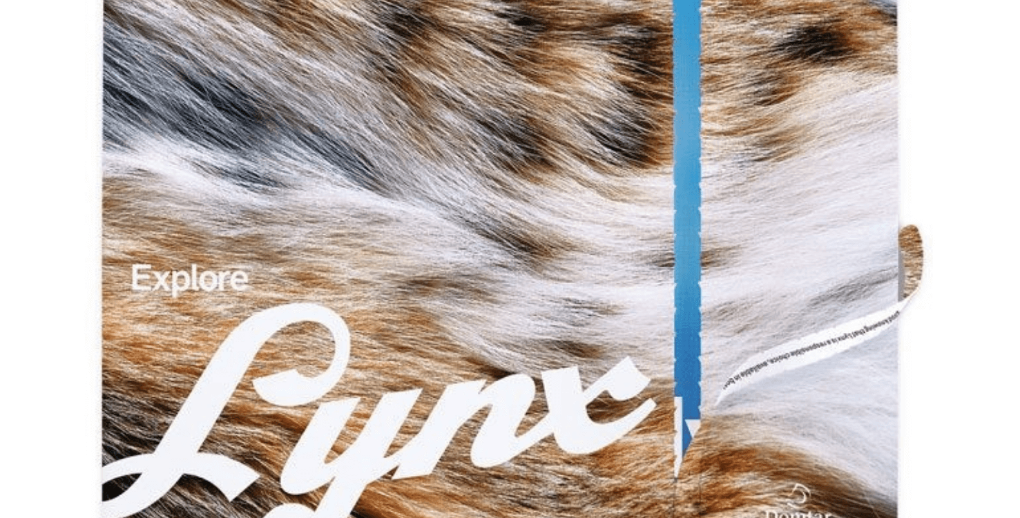
For today’s Throwback Thursday, we are going back to 2016, to the release of “Explore Lynx”. Drawing parallels to the concept of exploring overlooked places and things, this piece showcases the full potential of Lynx® Opaque Ultra. Lynx is definitely a brand of uncoated paper that you should not sleep on.
The images throughout this piece are intense, the colors are vibrant, there’s rich black, the message is clear – and the brochure successfully proves that not all uncoated papers are created equal. The printing of this promotion also provided us with some great tips to keep in mind when printing on uncoated paper. Here are some tips on exploring the possibilities with Lynx.
(Now friends…before I begin, I just want to say the pictures featured in this blog do not do this piece justice. Hopefully, some of you are printed piece squirrels like me and have a pristine copy of this brochure in your files to use as you read along.)
Explore the Dark Side
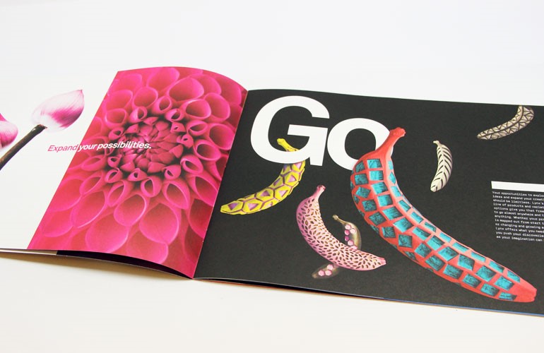
It’s true that coated papers are designed to absorb less ink and will naturally print a darker black. However, heavy dark solids can print beautifully on uncoated papers like Lynx. Let’s take a look at this spread:
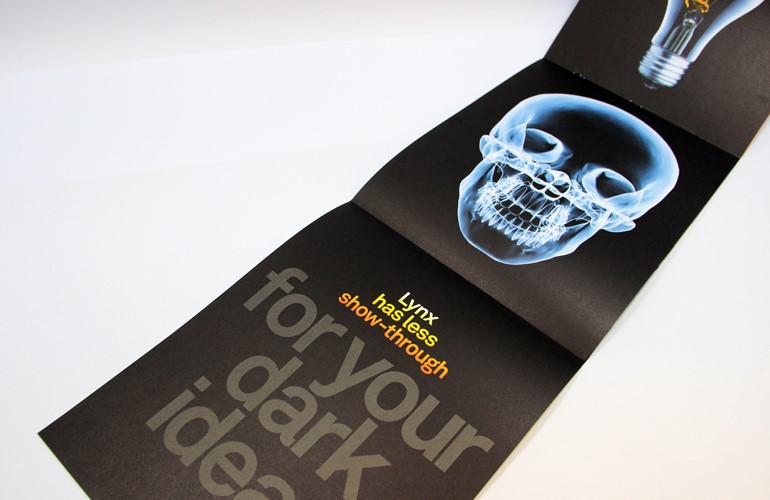
The picture does not do this spread justice. I’m not sure if you are seeing this, but the black featured here is as dark as midnight. Can you believe it was printed on an uncoated paper?! You too can easily achieve a velvety, rich black while also providing uncoated paper’s unique tactile experience. The richness of the background was achieved with two (2) hits of rich black plus a match blue screen. The image itself….just the Lynx shining through!
In case you missed it, we also put together a great video about decoding rich blacks and a blog about how and when to use rich blacks – be sure to check them out.
Use a Custom Ink Build
Some brands have colors that are a little brighter or a little bolder than your typical PMS values. These colors can easily become showstoppers on uncoated paper like Lynx.
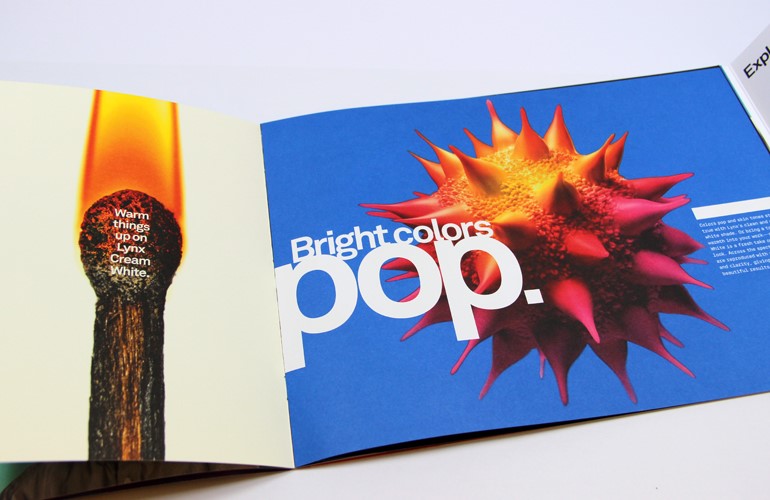
Although a touch plate can help you build vibrant colors like what are featured here, an additional print unit usually with a match or fluorescent ink is required. We were fortunate to partner with a great printer – Active – to figure out another way to achieve the same impact.
They were able to achieve this look by formulating a custom ink for some of the spreads that needed additional color pop. The custom inks blended process ink and fluorescent ink. We used this on several of the images with magenta and yellow components that really needed to pop off the page. You can adjust the impact by adjusting the fluorescent portion of the ink formulation.
Better Blues
Ah, the color blue. Whether it’s Midnight, Royal, Navy, Tiffany or Cobalt, achieving large blue solids or screens can be challenging on uncoated paper. Imagine this: everything else in your piece looks great – but your solid shades of blue (or purple) are looking streaky or mottled. This is what is known as the dreaded back trap mottle. A good trick to remember if you are printing large blue solids or screens is to move the Cyan towards the end of your ink rotation. Cyan ink can be challenging with respect to ink mottle. By moving it to the end of your color sequence, you will see a much smoother ink lay.
Mix It Up
There may also be times that you come across colors on press that do not match up to the colors on the proof. A good workaround for this is to change the order in which the inks are laid on the paper. Because CMYK inks are working together to create the final image, changing the order can change the overall tone of the entire page. For example, moving Cyan to the end of the run will give the overall image a cooler tone.
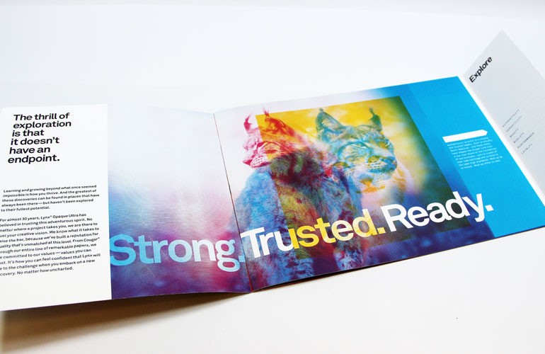
Lynx has definitely earned its reputation for unmatched quality – and this piece is a true testament to that. If you have not already, be sure to check out how Lynx has been the high-performing paper of choice for graphic designers and commercial printers for almost 35 years.

Discussion