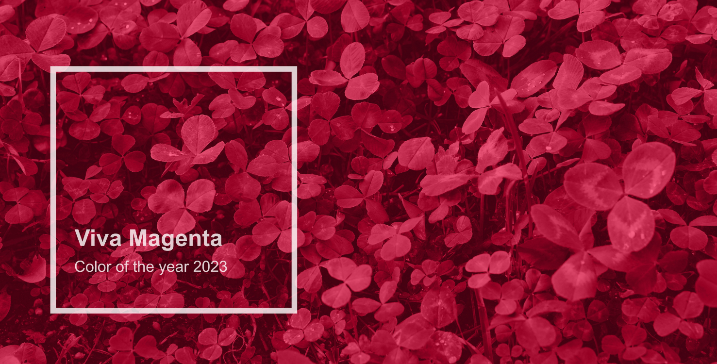
Every December, Pantone (the global authority on color) announces the color of the year. This year’s honor goes to Viva Magenta, also known as Pantone 18-1750. Described as “a nuanced crimson red tone that presents a balance between warm and cool”, Viva Magenta evokes bravery and fearlessness and stands as a signal of strength as we write a new narrative for the coming year.
I am very interested in the origins and psychology of colors, so I did a little research on this year’s choice.
Appreciation For Natural World
This year’s color is intended to represent society’s growing appreciation of the natural world. As movements around climate change, sustainability and land protection grow, society is being pulled towards natural colors. With that concept in mind, the origin of Viva Magenta is a carmine dye, produced by the cochineal beetle.
To further illustrate this point, Pantone created a color palette to provide inspiration on how to use Viva Magenta:
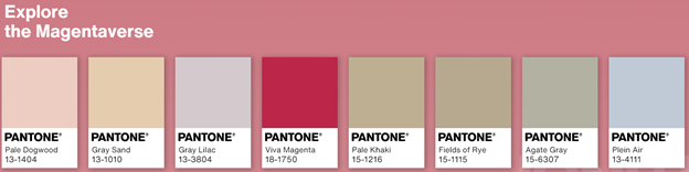
Source: Pantone Color Institute
This color combo immediately reminds me of mountain sunrises and desert sunsets.
We feature a similar palette in the Cougar paper swatchbook:
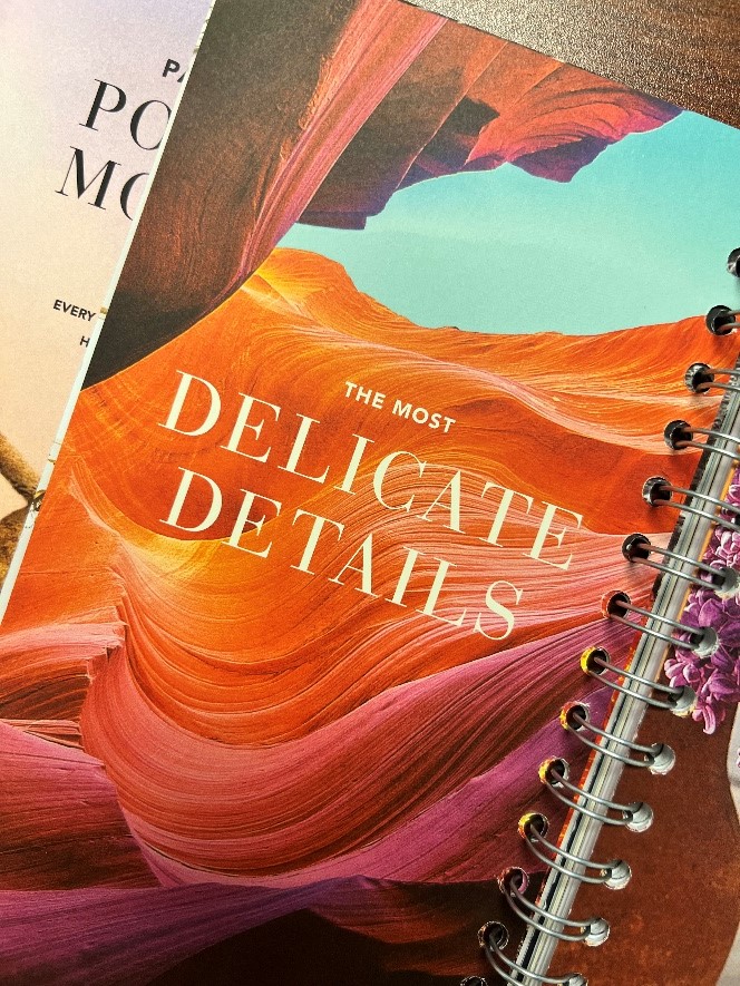
This page in the swatchbook (above) was printed on Cougar Natural paper. As you can see, Cougar Natural delivers rich color and details for any combination of colors. Consider using a natural color paper when printing this type of color palette to give your project a different aesthetic – one that feels warm and gives off an elevated vintage nostalgic vibe.
A Power Color That Celebrates Life
Viva Magenta is a bright red, intended to evoke feelings of pure joy. It also “welcomes anyone and everyone with the same verve for life and rebellious spirit”. It is a color that is inclusive for all and encourages experimentation and unconstrained self-expression.
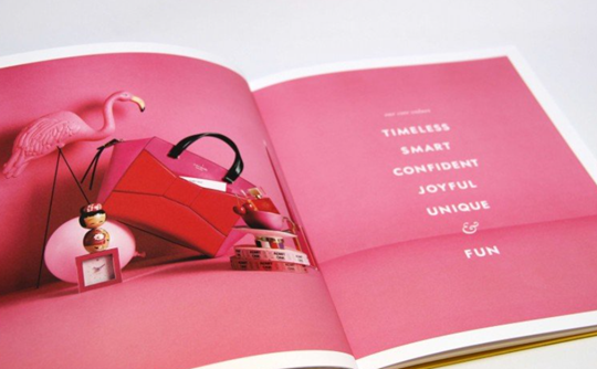
Uncoated paper can reproduce bright colors beautifully, as illustrated by the Kate Spade Brand book (above). Viva Magenta is featured heavily in this book, and it is a color that stands out and gets noticed. When it comes to an excellent paper choice for printing Viva Magenta, there is one option that always delivers – Cougar. Cougar’s smooth, velvety finish elevates colors, creating mesmerizing detail that makes images come alive.
We encourage you to be bold and create amazing pieces using Pantone 18-1750 – Cougar paper can handle it.
How to Use Viva Magenta
Bright, bold colors are proven to elicit strong consumer reactions. Viva Magenta almost pulsates with vitality and will be sure to capture your audience’s attention. The use of bold, bright colors also helps your brand appear animated and passionate. These bold colors can have an overwhelming effect, so consider using them as an accent color.
Nothing makes bright colors pop like a white background. The white background gives eyes a chance to “breathe” and take everything in. Cougar features a 98 bright white sheet providing both a perfect canvas for bright colors as well as an eye-pleasing white shade.

Discussion