
It’s been said that we only have four seconds to make an impression. If that’s the case, marketers have their work cut out for them. Luckily, smart creatives know the value of print when it comes to helping brands connect with their audience. Due to its tactile nature, print is one of the most effective ways for brands to communicate their messaging. And when you combine the feel of print with the visual impact of color, designers have the ability to craft a very powerful message.
THE IMPACT OF COLOR ON BRANDING
When it comes to branding, perception is everything, and even more reason to pay close attention to color. A rich and complementary color palette is essential to conveying the value and character of a brand. Creatives carefully consider the identity system when choosing a color palette; visual components like stationery, website, packaging and print collateral are all affected by color selection. And color is even more critical when we’re talking about identity systems for B2C companies. Choosing the right color palette is more than mere aesthetics. Studies have shown that the decision to purchase is hugely affected by color. Consumers look for visual cues to reinforce their perception of a brand’s personality and color is one of the biggest cues in reinforcing brand perception. Is it any wonder designers spend hours during the concept phase creating mood boards?
When it comes to print there are a number of ways to incorporate pops of color into a printed piece. Ink on paper is the most obvious way to achieve this. Most people will consider offset litho for the win when it comes to printing color, and with good reason, it offers beautiful results. But here are a few ways to add color to your printed piece that you might not have considered.
FLUORESCENT INKS
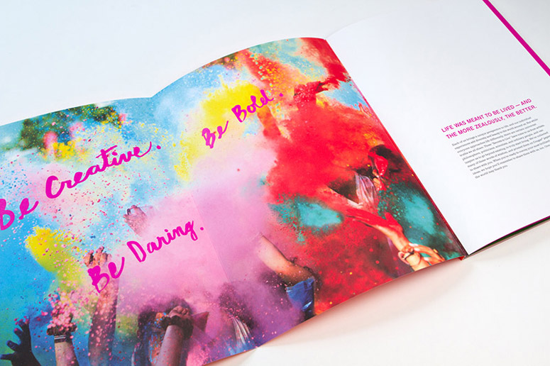
One of my favorite print pieces in recent years is Domtar’s LIVE on Cougar®. This Cougar paper promotion made stunning use of fluorescent inks to add bold pops of color. A fluorescent touch plate is a great way to bump up the intensity of color in your print design.
UV PRINTING
Another technology I love for really getting ink to pop off the sheet is UV printing. Unlike conventional printing where you can have noticeable dry-back, UV printing cures the ink (drying it as passes through the UV interdeck) locking in the intensity of the color and minimizing dry-back. I have seen amazing results using metallic inks and UV printing.
PRINT TECHNIQUES
By employing techniques like screens, varnishes and duo-tones, designers can give a two-color piece a four-color appearance.
PAPER SELECTION

Of course, paper selection has the ability to transform a color’s impact on a printed piece. While smooth bright white papers offer a beautiful canvas for flood-coating a sheet with color, using a cream white sheet offers a touch of warmth for skin tones and can heat up the use of reds, pinks, yellows and oranges in images.

And don’t forget about the use of bright papers like EarthChoice® Colors + HOTS®! They can make a big statement with minimal impact on the budget. Let the paper color act as the fifth color in the traditional four-color process, or pair it with one color like silver metallic ink or digital white ink for impactful results.
Thinking about strategic ways to use color in a printed piece allows creatives to do more with less without compromising the integrity of the design.
Discussion