
When it comes to grabbing your audience’s attention, there is nothing quite like color. Because the brain notices color before shapes or words, it is often the reason why a customer chooses to buy. In fact, colors influence 85% of shoppers’ purchase decisions.
Fortunately, using color isn’t limited to full-color print and vibrant logos – you can also incorporate color paper into your project. Using color paper for the first time (or for the 100th time) can sometimes be intimidating, so we’ve compiled a few tips to make it easier for you. By using these tricks (and Lettermark Colors) in your next project, you can be guaranteed your piece will make a mark on your audience.
Treat white space and highlights differently.
When projects are printed on white paper, the paper’s color is used to create highlights. When designing for color paper, remember that any white space or highlights in your design will be the color of the paper itself.
**Designer Tip: You can create the impression of white in your design without using a spot color. Try using a very pale color from the Lettermark Colors line, like yellow or cream. It will mimic the effect of a highlight beautifully.
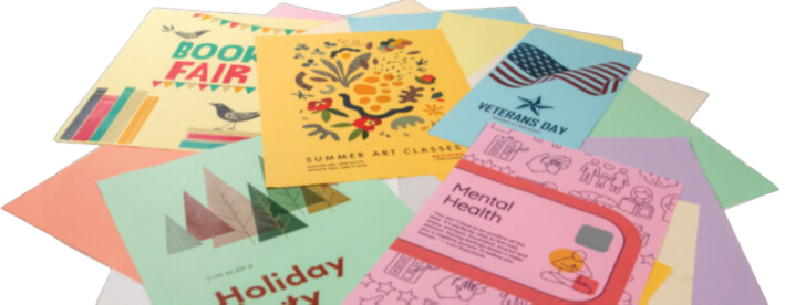
2. Don’t limit yourself on the types of graphics you use.
When designing for color paper, you’re not limited to monochromatic or grayscale images. Combining the stylish pastel and cream colors in the Lettermark line with contrasting colors and bold images in your design will add depth and visual interest to your work.
**Designer Tip: When working on your project, be sure to set your art layer to “Multiply” over the simulated paper colors to get a truer sense of how the inks will interact with the paper color. Be sure to remove the base layer prior to printing.
3. Account for color paper’s impact on ink color.
Since CMYK inks are transparent, the paper color will affect how the ink appears when printed. You may need to adjust the color or increase saturation if colors are getting muddy or lost.
**Designer Tip: If you want to maintain the true color of your design without any influence from the paper, consider adding an opaque white layer under the printed areas. This technique ensures that the full color of your design comes through without being affected by the paper’s hue.

Be sure to download our Color Paper Best Practices Guide for additional tips and tricks for using color paper. We’ve also included a color match chart, which is a must-have tool for seeing how color paper will affect your design.
By considering these best practices and tips, you can confidently incorporate color paper into your design projects. The Lettermark™ Colors paper collection offers a wide range of dazzling options to choose from, allowing you to create visually stunning and impactful printed materials. Experiment, explore, and let the power of color paper elevate your designs to new heights.

Discussion