So you are printing a Pantone Matching System® (PMS) color on uncoated stock. Is the color saturation as “deep” as you expected? Are you getting good uniform coverage of the paper surface? If you answered “no” to either of these questions, the solution may actually lie with the ink formula.
Standard process inks are transparent. This allows us to overlay the 4 basic process colors and build an endless spectrum of shades. PMS colors are used to provide spot color and are the best way to ensure consistent color for logos or other corporate identity pieces no matter which printing company or press creates your printed piece.
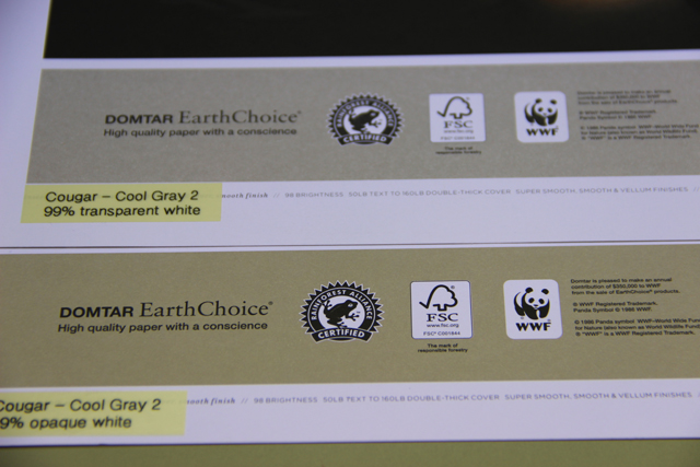
Many PMS colors are formulated with a significant component of white ink. Although we rarely trap PMS colors over other print areas, the white component of the ink tends to be transparent white. PMS colors formulated with a large component of transparent white may not provide good coverage of the base sheet fibers. This causes a phenomenon we refer to as “breaking white” where the base paper fibers show through the ink. The result is a print area that appears mottled and lacking in color strength.
The best way to overcome this issue would be to replace the transparent white in your formula with opaque white. As long as there is no trapping with the PMS color, this should not present any issues with color development. We explored this technique recently while printing Cougar with Cool Gray 2. This color is 99% transparent while. The ink was reformulated with Opaque white and produced a much smoother ink lay with more intense color saturation. Although there is a slight, but not significant, shift in the hue of the ink due to the addition of the white pigment, the improved coverage and uniformity of the ink lay make this a better option for achieving optimized print quality.
As you prepare to use spot colors on your next job, talk with your printer and your ink supplier about formula options that could make your final product stand out. With something as basic as a few ink drawdowns on your substrate of choice, you can hone in on the exact formula to match the color you have envisioned
Discussion