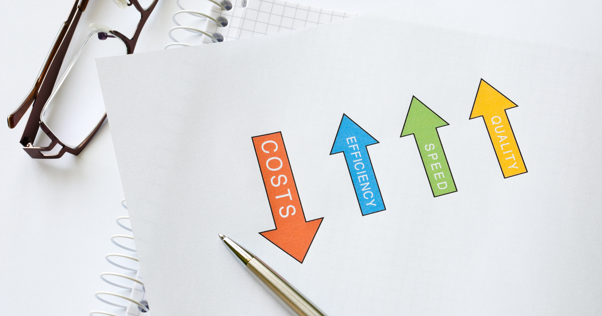
Making Affordable Print Look Amazing
It should come as no surprise that marketers are going to have to rethink how they communicate to customers in 2021. Limited budgets, changing customer needs and evolving modes of communication will all factor into how we share information and engage with audiences. One thing holds true – print should continue to be part of the marketing mix. How print is done and what it looks like will certainly change and Domtar Paper is your partner on that journey. We have a TON of content out there about how to make affordable print look amazing (seriously, have you read our blogs?!), so I compiled four of my favorites.
Mix It Up
A great way to make your affordable print looking amazing is to mix finishes within a paper line. For example, our Cougar line has three different finishes – smooth, super smooth and vellum. Imagine using different finishes on different pages or components of your project. Each is distinctly different and each provides a different tactile experience…yet they all work together to make your message unforgettable.
Our recent Lynx for Sure promotion is a recent example of mixing finishes. (If you haven’t received it, be sure to request it here.) Not only did we mix text and cover weights, but we also seamlessly mixed smooth and super smooth finishes.
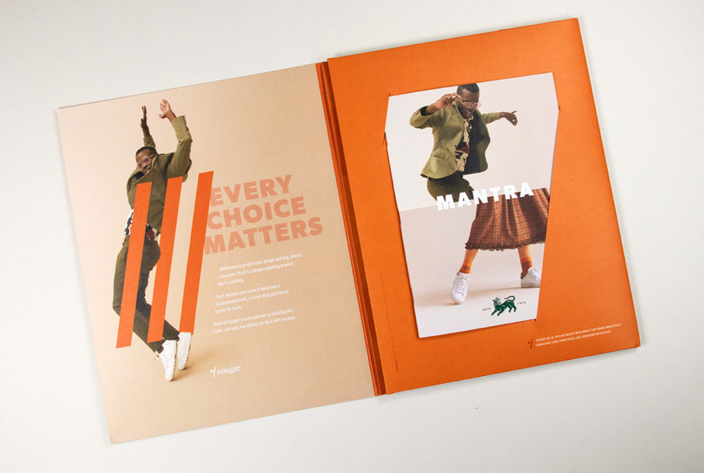
Cover All Your Basis Weights
As I mentioned before, another great way to change up your printed pieces is to mix basis weights…or not. A huge trend right now is the self-cover. Self-covers utilize the same basis weight for both the cover and insides of the brochure. The beauty of this format is that you can eliminate an extra form when printing and also consolidate your paper order. The result is a minimalistic aesthetic that is all the rage right now.
Be sure to check out the lookbook in the recent Cougar w/Purpose promotion for an example of a self-cover. (Still haven’t gotten that one either? Be sure to click here.)
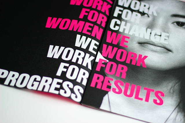
Rethink Your Color Palette
When asked what makes an impact in a printed piece, the answer is typically colorful photography and graphics. But what if you used a limited color palette instead? I LOVE the gallery piece for The Women’s Foundation. The piece is a showstopper but was obviously designed with a budget in mind. The limited color palette (PMS 806, PMS7520 and Black), combined with bold typography and exceptional print quality make this piece a vision, drawing readers in.
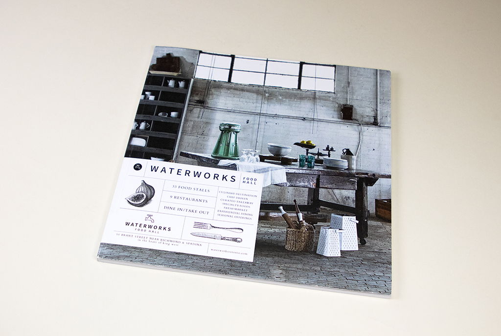
Don’t Discount Digital
Digital printing has come a long way in the last 10 years ago and is a great option for smaller runs that yield spectacular results. The days when digital printing was a “quick and cheap way to print” are long gone, and it now provides a great option for important pieces that don’t require a large print run. This is especially important post-pandemic as marketing budgets are cut – but engagement via print is still desired.
Still, think digital printing isn’t an option for a high-end printed piece? The Waterworks Food Hall booklet will make you do a double-take. This piece was printed on an iGen5, using Cougar Cover. Elegant and sophisticated, the printed results expertly and accurately convey the vibrant lifestyle present in one of Toronto’s most exciting urban neighborhoods.

Discussion