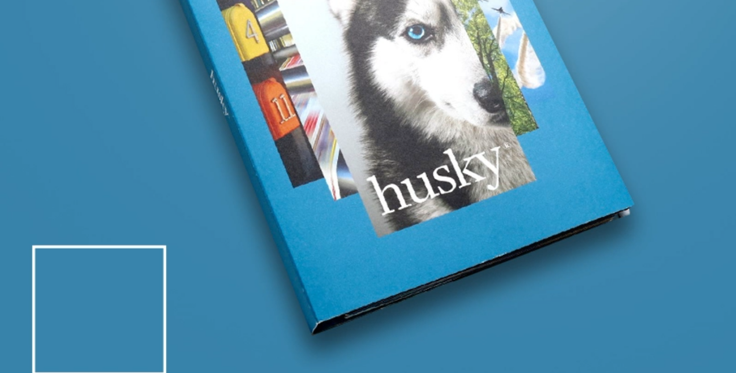
I was in the pressroom last week working on new brochures that highlight the attributes of Domtar’s Husky®, Lynx® and Cougar® products. The front and back panels of each brochure had very large solids that I wanted to match the colors of the product swatchbooks. We didn’t think this was a big deal…until we got on press.
The forms we were printing were new. The theme was the same, but the images were not the same as the swatchbook artwork. And, most importantly, we were printing the new forms in a totally different pressroom. Printers may struggle with matching large solids that were not originally printed on their press. There are a number of factors that impact this, including: line screen, dot gain, inks and the press itself.
The swatchbooks we wanted to match were printed 4-color process with a 175 line screen. The new artwork was also 4-color, but we were running a 211 line screen on the press. The proofs we reviewed (printed via inkjet on coated stock) appeared to be a decent representation of the color we intended to print (via offset on uncoated stock). Needless to say, when we pulled our first sheet on press we were sorely disappointed.
The 4-color images looked pretty good. The large background colors did not. On press adjustment of the large solids was not an option since it would change the hue of the images.
Pre-press to the rescue! I know I’ve said this before, but I equate the skill of the pre-press folks I have worked with to MAGIC. Our first form was for the Cougar brochure. We studied the shade of orange we had achieved on press and discussed the “too much red”& “too dark” attributes and sent the form back to pre-press for overall adjustments. Then it was back to the press to evaluate how our changes impacted the overall color.
The good news: we were able to get the color match to the point where we were able to sign off on all of the forms. Knowing we were matching a wet ink film to a finished piece, we anticipated some slight color change after approval, but knew we would be in an acceptable place.
The bad news: We went through this process with pre-press several times for each of the 3 brochures in order to get a satisfactory match to the previously printed swatchbooks. For each change, new plates needed to be made, hung and registered. Time consuming for sure, but worth the effort.
Solution: If I need to do something like this again, I would consider having a match color prepared and approved ahead of the print run. Drawdowns with match colors on the paper we were printing would have shown us the exact color to expect and would have eliminated the on-press color matching challenge.
Discussion