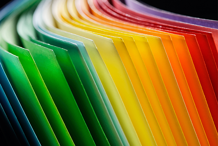
When designing for color paper, it is important to take the shade of your paper into consideration. The reason for this goes back to the basics of mixing color palettes. Blue ink on white paper will look different from blue ink on pink paper.
Before you start designing, consider what your goals and objectives are, what your message will be and what sort of assets you will be incorporating into the design before you select the actual shade of paper. From there, here are a few key elements to take into consideration before you start designing.
- The Ink — CMYK inks are transparent, not opaque. This means that the color of the paper will show through the printed design. For example, an image with a green base will appear greener when printed on green paper. Even cream-colored papers can affect the images, making the design look warmer thanks to the yellow undertones of the paper. This effect could even be desirable, as you can use the color of paper to influence and enhance your design.
- The Highlights — With projects printed on white paper, the paper’s color is used to create highlights. The same effect happens with color paper; therefore, use the same color as the stock to create the highlights of the design. If you need to create the impression of white in the design, you can do it without having to resort to a spot color. Instead, try using a very pale color, such as light yellow or light blue. It won’t be white, but it can mimic the effect on color paper.
- The Computer — While you can’t rely on your computer monitor to accurately depict the printed color of a design, you can use it as a tool to help understand the way the color will affect your images. Create layers in your document, with a base layer the same color as the stock you will use, and the design layers on top so you can see how the finished project might look. Remove the base layer prior to printing.
A Better Final Product
As always, communication with the printer is important for making sure the finished job looks the way you expect it to look. When working with color paper, ask for a printed sample on the stock you have chosen, so you have an idea of what the color actually looks like and how the stock accepts ink.
You can always request a press proof of your own project, although this might be a more expensive choice. Another option is to ask for a digital proof, which may be easier for the printer to provide, even if your project is meant for offset printing. You can simulate the color of the paper in the art file and run a digital proof to get a reasonable idea of the final outcome; just keep in mind that it won’t be an exact representation of the end result.
Discussion