
Last week, the Pantone Color Institute released the 2022 color of the year – Pantone 17-3938 Veri Peri. A joyful shade that both soothes like blue but excites like red, Veri Peri was created as a way to symbolize our transition out of the COVID-19 pandemic. And in the spirit of the transformational times we are living in, Pantone chose to create a brand new color rather than select a shade from their existing color formulas.
Are you inspired by the Veri Peri color, but unsure where to start? Here are some examples from our past promotions that may spark some ideas for your next big project.
Very Peri Can Help Give Your Piece Some Soul
While Pantone has stated Veri Peri is intended to emulate the essence of glowing screens and gaming (and the merging of our digital world and physical life), the shade has roots in nature.
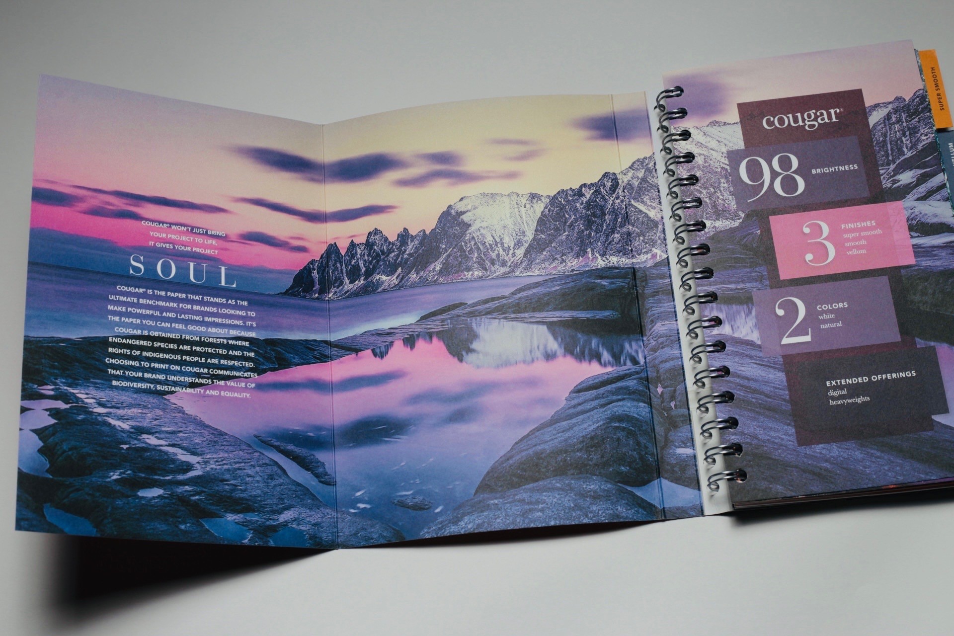
As evidenced in the inside front cover of the Cougar Swatchbook, shades similar to Veri Peri frequently appear in landscapes and sunrises. Images like these can convey the idea of power and lasting impressions and can be used to represent topics like sustainability (instead of the usual “green” photos). Bonus: If your piece has a sustainability focus, Cougar is an uncoated paper you can feel good about using. Cougar is obtained from forests where endangered species are protected and the rights of indigenous people are respected. Choosing to print on Cougar communicates that you and your brand understand the values of sustainability, biodiversity and equality.
Veri Peri Can Help You Stand Out
Displaying carefree confidence and daring curiosity, Veri Peri is intended to help open up a new vision and allow us to be strange (and help us stand out).
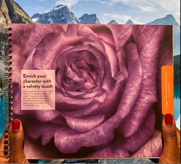
Nature’s unique creations – like this rose – are a perfect way to get your message across in a slightly different way. Look for photos and imagery that force your audience to take a second look. But standing out is more than just looking different – it’s about delighting the senses as well (especially in print). The signature, velvety texture of Cougar Paper’s smooth finish can heighten your brand’s tactile experience, making every moment feel exceptional.
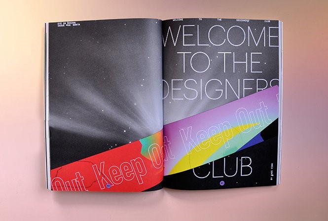
Veri Peri Can Give You The Ying To A Yang
In one of our gallery favorites, Eye on Design, a shade similar to Veri Peri is used throughout. Veri Peri has an almost ethereal feel to it – and as you can see, it can be a great base to use with brighter colors like red, magenta and yellow.
Veri Peri can also be paired with a lush green shade for a refreshing representation of nature or combined with mauve for balance and comfort. Any way you use it, it can add an imaginative, optimistic attitude to your design.
Pantone believes that color is a critical form of communication and a way to express our ideas and emotions – and we can’t agree more.

Discussion